

You've sketched an Arsenal-inspired tee for a mate, a matchday crew or a small merch line. The red looks right on screen, but the moment you add a cannon, crest-like mark or familiar zig-zag, the design question changes. You're no longer deciding only whether the shirt looks good. You're deciding what makes it recognisably Arsenal, what makes it worth wearing, and what could create legal trouble.
A strong Arsenal t shirt design treats heritage, signifiers, production and wearability as one system. The process starts with the club's visual history, then moves through licensing boundaries, concept development, print preparation, mockups, garment selection and merchandising. If you want broader inspiration before opening your design software, the Bulk Image Generation t-shirt guide offers useful prompts for exploring graphic directions. Arsenal's kit history is also worth studying through this guide to Arsenal shirts through the years, because the details that look decorative at first often carry the most meaning.
Why Arsenal Fan Tees Are a Design Category of Their Own
A generic football tee can survive on a large slogan and a loud graphic. An Arsenal tee has less room for guesswork. Supporters recognise the relationship between red, white, the cannon, the crest, the proportions and the era being referenced before they've consciously inspected the artwork.
That response comes from a long visual history. Arsenal's shirt identity began in 1886, when players from Dial Square adopted dark red shirts from Nottingham Forest. In 1933, manager Herbert Chapman introduced the red shirt with white sleeves, a change that established the visual language of the modern Arsenal kit. The club badge first appeared on the shirt in 1967, while manufacturer branding arrived in the late 1970s, showing how the shirt developed from a simple identity marker into a commercial design surface. The club's official kit history documents that progression.
Five jobs behind a successful design
When I develop fanwear, I separate the work into five decisions rather than trying to solve everything in one illustration.
- Recognition: Can a supporter identify the reference from the colour structure and silhouette before reading the wording?
- Authenticity: Does the design borrow from a meaningful Arsenal era, or does it just place red graphics on a white tee?
- Legality: Are protected marks being used, imitated too closely or presented in a way that suggests official approval?
- Production: Will the artwork hold its shape, colour and detail on the chosen fabric and print method?
- Wearability: Can someone wear it at a match, in a pub or on an ordinary day without feeling that the shirt is costume-like?
The most common mistake is starting with nostalgia and ending there. A retro reference only works when the designer understands which visual cue carries the memory and which parts are surface decoration. The aim isn't to reproduce a historic shirt. It's to translate its strongest signals into a garment that works now.
The Design Elements That Make a Tee Read as Arsenal
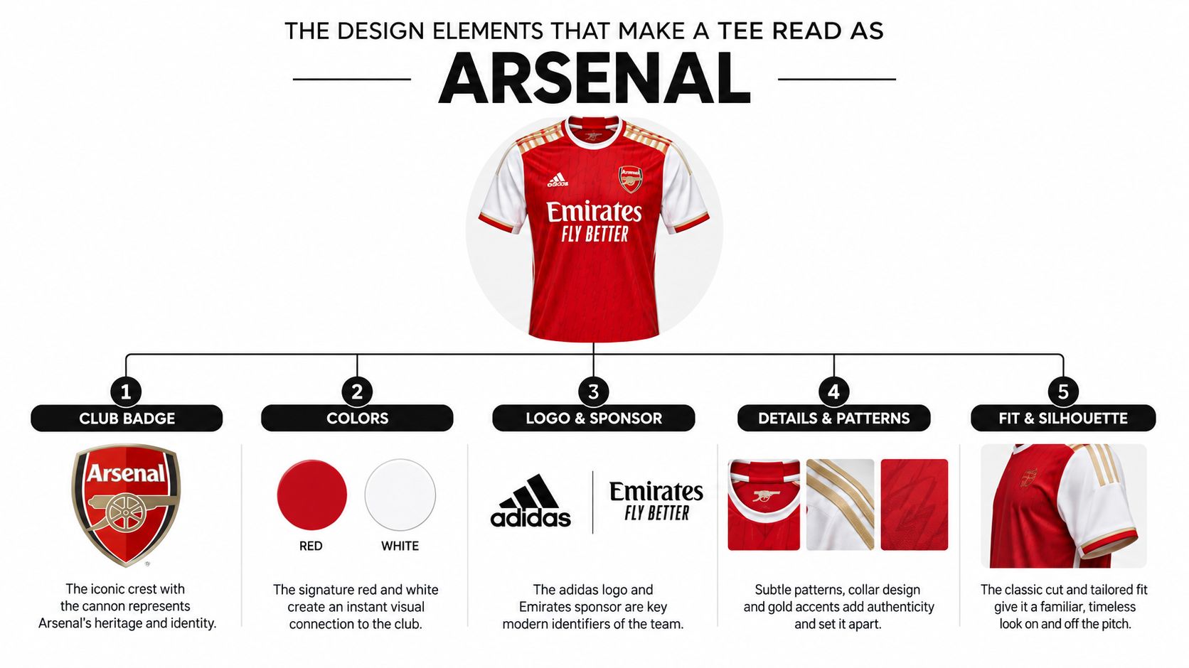
Before choosing a typeface or drawing a graphic, establish the signifier hierarchy. Crest, cannon, colour blocking and trim language are not equal parts of the composition. Kit design practice locks that hierarchy first and tests 2–3 concept families with supporter feedback before finalising artwork. Historical English football-shirt research also recorded badge presence increasing from 60% to 82% between the 1974/75 and 1979/80 seasons, a shift linked to stronger recognisability in the replica market. The design process and those figures are discussed in this account of football kit design.
Build the hierarchy from the strongest cue
Colour comes first at distance. Bright red and white connect most directly with Arsenal's home identity, especially when the red is used in confident blocks rather than diluted into a generic burgundy gradient. White sleeves, shoulder panels, collars, cuffs and side inserts can suggest the classic structure without turning the tee into a replica.
The cannon is the most useful secondary signifier for an original fan design. It gives you a clear shape to reinterpret through linework, negative space, embroidery or a repeated pattern. Keep its proportions deliberate. A loosely redrawn cannon can look like a random sports emblem, while a clean, restrained version immediately establishes the football reference.
The crest requires the greatest care. If you're working with licensed artwork, preserve its proportions, placement and colour relationships. If you're creating an unofficial design, don't redraw it so closely that the result appears to be a substitute badge. Original lettering, abstract motifs and historical references give you more creative room.
Turn a retro reference into a modern graphic
The 1930s Art Deco period, the 1971 double-winning side and the 1990s Bruised Banana away design all offer stronger starting points than vague “vintage football” styling. A practical reinterpretation of the Bruised Banana begins with the zig-zag rhythm, not a direct copy of the shirt. Reduce the zig-zag into a repeating angular line, place it inside a controlled panel or use it as a tonal texture across a neutral base. Keep the red or cannon detail as the focal point, then allow the yellow and dark contrast to support it.
Design rule: If removing one detail makes the shirt unrecognisable, that detail belongs near the top of the hierarchy. If removing it changes nothing, it's probably decoration.
Staying Legal With Club Marks and Branding
The assumption that a club crest or cannon is fair game because it appears on a public shirt is expensive. Arsenal's crest, cannon and club name are protected brand assets, and unlicensed use of official marks can lead to listings being removed, stock being held or enforcement action being taken. Retail guidance also treats accurate logos and colours as licensing-sensitive elements, which is why checking how to spot fake football shirts is useful even when you're designing new fanwear rather than buying vintage clothing.
Separate licensed design from inspired design
There are two very different routes:
- Licensed merchandise: You have permission to use the relevant marks, artwork and wording, and you follow the brand's production requirements.
- Unofficial fan apparel: You create original artwork that expresses supporter culture without copying protected identifiers or implying club endorsement.
The second route still needs discipline. Original typography, a red-and-white palette, abstract references to North London, a simplified stadium roofline or a newly drawn football motif can communicate affiliation without reproducing the official badge. Calling something “official” or presenting it with official-looking packaging creates a separate risk from merely using a football-inspired idea.
A phrase such as “fan-made design” can clarify your position, but wording won't cure copied artwork. The graphic itself must be original, and marketplace titles, product descriptions and photographs should avoid suggesting authorisation that you don't have.
Check the garment information
UK textile rules require fibre composition to appear clearly and legibly. Where a shirt contains multiple fibres, the constituent fibres must be listed by name and weight percentage in descending order. Decorative matter making up 7% or less of the product is excluded from the fibre-content indication, according to UK textile labelling guidance.
Before sending artwork to print, run this checklist:
- Is every crest, cannon and wordmark licensed or replaced with original artwork?
- Does the product copy avoid implying official club approval?
- Are labels and product pages accurate for the garment composition?
- Have you checked artwork ownership, fonts, stock illustrations and mockup rights?
- Would a supporter understand what is official and what is fan-made?
Tools, Templates and Your Design Workflow
The right tool depends on the artwork, not the perceived prestige of the software. A vector editor such as Adobe Illustrator, Affinity Designer or Inkscape is suitable for crisp cannon-inspired linework, geometric panels and artwork that needs to scale cleanly. Raster software such as Photoshop, Photopea or Procreate is useful for textured treatments, but keep the final brand-critical details as vectors or high-resolution layers whenever possible.
Start with the garment, print area and audience. A small left-chest mark needs a different composition from a full-front matchday graphic, and an athletic polyester tee may reproduce colour and texture differently from a heavy cotton blank.
A repeatable working sequence
- Set the document for production. Use the printer's required dimensions and resolution, name every layer clearly, and keep a separate editable master file. Don't flatten the artwork before colour and placement checks.
- Block the composition. Establish the red, white and supporting colours as broad shapes. At this stage, ignore tiny texture details and judge the shirt from a distance.
- Lock the hierarchy. Give the strongest original signifier the largest or clearest role. The cannon, geometric pattern or typographic treatment should support the club reference rather than compete with every other element.
- Create 2–3 concept families. One route might use restrained Art Deco geometry, another might reinterpret the Bruised Banana zig-zag, and a third might use a minimal cannon and tonal red blocking.
- Ask supporters for focused feedback. Don't ask whether people “like it”. Ask which era they recognise, what they notice first and whether the shirt feels like a fan item, fashion piece or imitation kit.
- Prepare the handoff. Separate artwork layers for the main graphic, fine details, embroidery and any colour-critical elements. Include placement dimensions, garment colour, thread or ink references and notes about underbase requirements.
A structured tech pack template can help turn a promising concept into instructions a garment maker can follow. Arsenal has also stated that meaningful changes to the crest or home kit colours would require supporter consultation, which reinforces the practical point: colour consistency and badge placement aren't casual finishing touches. They're central constraints for any Arsenal-inspired design.
For personalised concepts, review examples of Arsenal personalised t-shirts before deciding whether names, dates or numbers improve the design. Personalisation should strengthen the story, not cover a weak composition.
Mockups and Printing Methods Compared
A digital mockup answers one question: does the concept look convincing on a garment? A physical sample answers several harder questions. Does the red remain strong on the fabric? Do fine lines close up? Does the shirt drape properly? Is the print comfortable against the skin?
Use both when the design matters. A flat mockup is efficient for comparing front and back placements, while a sample reveals distortion caused by seams, stretch, fabric texture and body movement. For presentation, show the tee in recognisable settings such as a stadium concourse, pub table or five-a-side pitch, but don't let a dramatic background hide the actual print area. Designers looking for a starting point can discover top mockup resources before building their own scenes.
Match the process to the artwork
| Method | Best For | Run Size | Durability |
|---|---|---|---|
| Screen printing | Bold colour blocks, limited palettes and strong geometric graphics | Small to large runs | High when properly cured |
| Direct-to-garment printing | Detailed, multi-colour artwork and tonal illustrations | Short runs and samples | Good, with care dependent on fabric and wash conditions |
| Vinyl transfer | Names, numbers, simple shapes and personalisation | Small runs | Good for suitable applications, though edges can affect comfort |
| Embroidery | Premium cannon-style marks, small badge-like details and restrained branding | Small to medium runs | High, but dense areas can add weight and stiffness |
Screen printing usually makes the most sense when the design depends on clean red and white blocks. DTG gives you more freedom for a layered illustration, but the artwork needs to be tested on the intended garment rather than judged only on a white digital canvas. Vinyl is practical for individual names or small batches, while embroidery adds a tactile finish that can make a restrained chest mark feel more considered.
Protect the critical details
Separate brand-critical elements into high-precision print layers or embroidery files. Keep line weights printable, avoid hairline gaps in reversed artwork and inspect small type at its actual output size. A screen preview can make a narrow line look clear even when the printer's ink spread will close it.
Run a colour-management check against Pantone-style target values, then test fabric shrinkage, hand-feel and wash behaviour. Logo distortion and colour drift are common reasons a shirt starts looking unofficial, even when the concept was sound. One sample can reveal more than another round of digital approval.
Styling, Merchandising and Final Checks
A finished tee has to work outside the artboard. A bold graphic usually sits best with neutral trousers, shorts or denim so the artwork leads. For matchday, layer it under an overshirt or lightweight jacket. A cleaner cannon-inspired mark can move into smart-casual territory with well-fitted trousers, while a polo version gives the same visual system a quieter silhouette.
Merchandising should reflect those use cases. Present the shirt as part of a coherent range rather than a lone graphic. A red-and-white system might extend into a tee, polo and drinkware, with the same zig-zag, trim language or typographic detail adapted to each product instead of pasted unchanged across every surface.
The price gap creates a clear design challenge. One survey put the going rate for an official Premier League shirt at £85, while less than 8% of fans considered that fair, as reported in Arsenal's kit inspiration coverage. The same source says one in three UK fans owns a fake football shirt and reports 158,000 fake football strips seized in a single raid. That context makes quality and honesty more important, not less. A well-made unofficial tee can offer a different value proposition, but an abstract design with poor printing still gives supporters little reason to choose it.
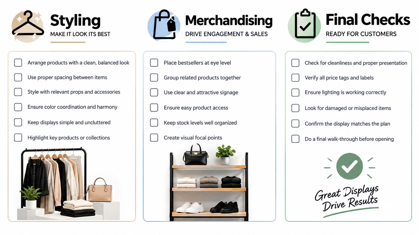
Use this final check before launch:
- Legality: Protected marks are licensed or replaced with original artwork.
- Recognition: The colour blocking and main signifier read clearly at a distance.
- Print quality: Reds match the target, fine details survive production and the sample feels comfortable.
- Sizing: The actual garment measurements and fit notes are accurate.
- Presentation: Product photography shows the shirt clearly, with no suggestion that unofficial merchandise is official.
- Range logic: Related items share a visual system without repeating one graphic mechanically.
For production and product evaluation, use documented apparel quality standards. For examples of how a retro system can translate beyond one garment, compare the Arsenal-inspired Bruised Banana athletic tee with the matching Bruised Banana polo.
SoccerWares offers custom-designed football apparel and drinkware alongside training essentials, giving you a practical place to compare how one Arsenal-inspired visual system works across products. Visit SoccerWares to explore the range and find a fanwear option built for matchday, training or everyday wear.