

To truly analyse football stats like a pro, you need to look beyond the final score. The real story of a team's performance isn't told in 90 minutes, but over the course of an entire season. This means digging into foundational metrics like goal difference, points per game, and long-term league position trends. These are the numbers that reveal the underlying patterns of success, decline, or hidden inconsistency.
Moving Beyond the Scoreline with Foundational Metrics
The final score is just a snapshot. A single win or loss can be misleading, driven by a lucky bounce, a moment of individual brilliance, or a contentious refereeing decision. Professional analysis demands a much broader perspective.
The true narrative of a team's strength is written over months. That’s where foundational team metrics come in. They provide the essential context required to understand a club’s genuine trajectory, smoothing out the emotional highs and lows of individual match days. Think of these stats as the bedrock of any solid analysis. Mastering them is the first step before you can dive into more complex player data or tactical events.
Key Foundational Team Metrics
First things first, you need to familiarise yourself with the data points that paint the bigger picture. You can find these on most league websites or sports data platforms.
- Goal Difference (GD): This is simply the number of goals a team has scored minus the goals they've conceded. It’s a beautifully simple yet powerful indicator of a team's overall balance. A large positive GD suggests a dominant team that is both dangerous in attack and frugal in defence.
- Points Per Game (PPG): This is calculated by dividing a team's total points by the number of matches they have played. PPG is a fantastic way to compare teams at different stages of the season, as it levels the playing field when one team has played more games than another.
- League Position Trends: Don't just glance at the current table. Track a team's position from week to week. Did they fly out of the blocks and then tail off? Are they a side that always starts slowly but finishes strongly? These trends often point to underlying strengths or weaknesses that the current standings alone don't reveal.
A team that consistently grinds out 1-0 wins might have the same points as a team winning chaotic 4-3 thrillers. But their goal differences tell two completely different stories about their style and sustainability. The first suggests defensive solidity and efficiency, while the second points to a volatile, high-risk approach that may not last.
This simple chart breaks down how different metrics—from raw output to underlying performance—are used to measure professional players.
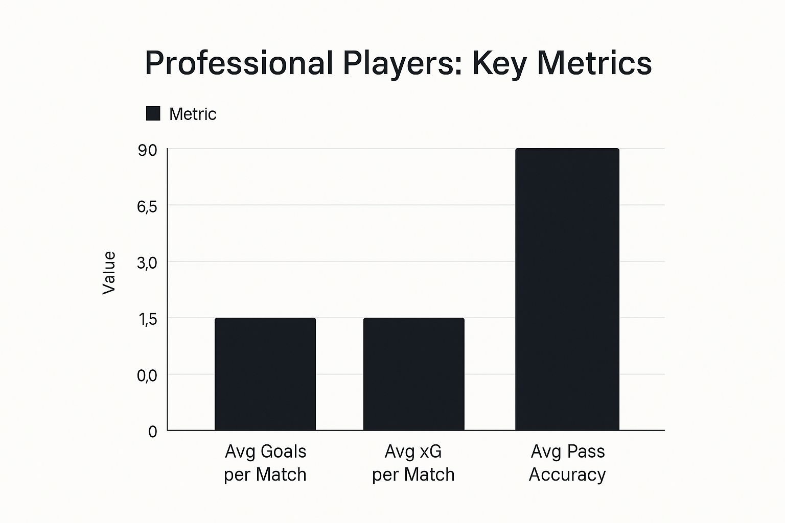
It shows that while goals are what everyone remembers, metrics like Expected Goals (xG) and pass accuracy give a much deeper insight into a player’s actual contribution and technical skill.
To help you get started, here's a quick rundown of some of the most important team performance metrics and what they really tell you.
Key Team Performance Metrics Explained
This table summarises the essential team-level statistics and what they reveal about a team's performance beyond just the final score.
| Metric | What It Measures | Why It's Important for Pro Analysis |
|---|---|---|
| Goal Difference (GD) | The net difference between goals scored and goals conceded over a season. | It’s the quickest way to judge a team's overall balance. A high GD isn't just about scoring; it's about dominating matches at both ends of the pitch. |
| Points Per Game (PPG) | The average number of points earned per match played. | Essential for comparing teams who have played an unequal number of games, providing a truer reflection of consistent form. |
| League Position Trend | A team's movement up or down the league table over several weeks or months. | Reveals momentum. A team climbing the table is in good form, while a team sliding down may have underlying issues with fitness, morale, or tactics. |
| Expected Goals (xG) | The quality of chances a team creates, based on historical data of similar shots. | This tells you if a team is getting lucky or unlucky. If their xG is high but goals are low, they might be a bit of finishing practice away from an attacking explosion. |
| Shots on Target | The number of shots that would have gone in if not for the goalkeeper. | A basic but crucial measure of attacking quality. Lots of shots are good, but lots of shots on target is what truly pressures an opponent. |
Looking at these metrics together gives you a far more nuanced and accurate picture of how a team is really performing.
Adding Context to the Numbers
Analysing football stats like a pro means knowing that numbers never exist in a vacuum. A great example is the history of the Premier League. Manchester United were the dominant force for years, racking up 13 titles since 1992. But more recently, Manchester City have taken over, winning six of the last seven seasons and smashing records along the way.
To understand that shift, you would look at their goal differences, win streaks, and points-per-game stats over the years. You'd also bring in crucial context, such as managerial changes or key player transfers. This is what separates surface-level observation from genuine analysis.
Even a simple league table is a goldmine of information if you know what to look for.
From this one screenshot, you can immediately see who is leading the pack, but you can also check the goal difference, which is often the tie-breaker and a clear indicator of a team's attacking firepower and defensive strength.
Decoding Player Impact with Advanced Statistics
Team performance gives you the big picture, but to really analyse football like a pro, you must get granular and look at individual players. This means moving beyond the headline-grabbing goals and assists to build a proper profile of a player's true influence on the pitch. Advanced stats are what reveal the hidden mechanics behind a great performance.
This is where we stop asking "what happened?" and start asking "how and why did it happen?". By looking at metrics like Expected Goals (xG) and Expected Assists (xA), we can judge the quality of a player’s actions, not just whether the ball hit the back of the net. This is what separates casual fans from professional scouts.
Beyond Goals and Assists
The most common stats are often the most misleading. Think about it: a striker might score from a wild deflection, while another could miss an open goal from six yards out. Raw goal counts don't tell you anything about luck versus skill, but the deeper metrics do.
These more sophisticated data points help you paint a much clearer picture of a player's actual effectiveness.
-
Expected Goals (xG): This is a brilliant metric. It measures the quality of a shot, assigning it a probability of being scored based on thousands of historical examples from similar situations. A player who consistently scores more goals than their xG suggests is an elite finisher. On the flip side, a player with a high xG but few goals might be getting into all the right positions but fluffing their lines.
-
Expected Assists (xA): Just like xG, this measures the likelihood that a given pass will become an assist. It credits the creator for a defence-splitting pass, even if the striker skies the shot over the bar. This is absolutely crucial for evaluating those creative midfielders whose value isn't always reflected in the traditional assist column.
-
Key Passes: A simpler but still effective stat. A key pass is one that leads directly to a shot on goal. It’s a great way to identify the players who are consistently carving out opportunities for their teammates and forming the creative hub of the attack.
A player might only have two assists in ten games, which looks poor on paper. But if their xA is 6.5, that tells you they’re creating high-quality chances that their teammates are failing to convert. Context is everything.
Measuring Player Efficiency
Comparing players across different teams and tactical systems is always tricky. A forward playing for a dominant, free-scoring side will naturally get more chances than one in a defensive, counter-attacking team. This is precisely why efficiency ratios are so important.
The most common and useful method is calculating stats on a per 90 minutes basis. This levels the playing field, allowing for fair comparisons between a regular starter and a substitute who only plays 20 minutes a game. Looking at goals, key passes, or tackles per 90 gives a much clearer picture of a player's impact when they're actually on the pitch.
When you dig into it, individual stats are a vital piece of the puzzle. In the Premier League era, for instance, goal-scoring efficiency tells a fascinating story. Alan Shearer is the all-time leading scorer, but what sets a player like Thierry Henry apart isn't just his raw total but his goals-per-match ratio—Henry managed an incredible 0.68 goals per match, highlighting just how clinical he was. You can dive into more of these all-time records on the official Premier League stats page.
Visualising Movement and Tactical Discipline
Sometimes, numbers alone don't capture a player's role within the team's structure. This is where positional data comes in, turning abstract stats into visual stories about how a player behaves on the pitch.
Two of the most useful visualisation tools are:
- Heat Maps: These show where a player spends most of their time. A winger's heat map should be glowing hot along the touchline, while a box-to-box midfielder's should show activity all over the park. It's a brilliant way to instantly see a player’s work rate and positional discipline.
- Pass Maps: These diagrams show the direction and frequency of a player's passes. They can reveal key partnerships on the pitch, like the link-up play between a fullback and a winger, or show you that a central midfielder is the team's main distributor.
For teams looking to improve these metrics on the training ground, organised drills are key. Using simple kit like high-quality training bibs from soccerwares.com can help structure sessions, assign roles, and make it easier to track player movements in practice games. By bringing these advanced statistical concepts into your analysis, you stop just watching the game and start evaluating players with the nuance and depth of a professional scout.
Uncovering Tactical Insights from In-Match Events
While team and player metrics provide a solid foundation, learning how to analyse football stats like a pro means reading the story of a match as it unfolds. Every game is a fluid narrative of tactical battles, momentum swings, and game-changing moments. Raw data from in-match events is your key to unlocking this tactical chess match.
Instead of just watching the ball, a true analyst tracks the flow of the game through statistics. They look for periods of sustained pressure, figure out which team is creating better chances, and pinpoint the exact moments the tactical balance shifts. It’s all about moving from a passive spectator to an active interpreter of the game's hidden patterns.
Reading the Flow of the Game
A match isn’t static; it ebbs and flows. A team might come out flying for the first 20 minutes, get pegged back, and then finish with a flurry. Understanding these phases is crucial, and specific stats help you nail them down.
-
Possession Spells: Don't just glance at the final 55% possession figure. Break the match into 15-minute chunks. Who had the ball and, more importantly, where? A team enjoying long spells in the opposition's final third is exerting serious pressure, a world away from a team just passing it harmlessly across their own backline.
-
Shot Conversion Rates: This metric cuts straight to clinical efficiency. A team that takes 20 shots but only scores once might be creating low-quality chances or just having an off-day in front of goal. On the other hand, a team that scores twice from five shots is being ruthless, which often points to a smarter tactical setup.
-
Defensive Errors: Tracking stats like errors leading to shots or goals can expose a team's weak points. If a side consistently makes mistakes late in games, it could signal issues with concentration or fitness that a coach needs to address quickly.
Pinpointing Game-Changing Moments
Certain events can completely flip a match on its head. A pro analyst knows how to isolate these moments and measure their impact by comparing the data from before and after.
Take a red card, for example. Before the sending-off, a team might have been dominating possession and creating chances. Afterwards, you would expect their possession to plummet, their defensive actions to skyrocket, and their attacking threat to fizzle out. By quantifying this shift, you can put a precise number on the red card’s tactical cost. The same principle applies to a key substitution, an injury to an influential player, or a sudden switch in formation.
A manager bringing on a speedy winger in the 70th minute isn't just a hopeful roll of the dice. By tracking the number of successful dribbles, crosses, and chances created from that player's flank in the final 20 minutes, you can objectively determine if the sub successfully exploited a tired full-back and won the game.
The statistical analysis of match events is critical for pro-level analysis in the UK. Looking at historic scorelines across the English Football League and Premier League helps put outlier performances into context. While the all-time record is still West Brom's insane 12-0 win over Darwen in 1892, more recently, Southampton suffered a brutal 0-9 home defeat to Leicester City in 2019. To properly evaluate a match like that, you have to dissect every event—possession, shot conversion, and errors—to understand the story, as you can see in these detailed English football records and statistics.
Visualising Team Structure and Strategy
Beyond individual actions, event data can reveal a team's entire tactical blueprint. Modern analysis uses clever visualisations to show how players interact and how formations actually work in the real world.
Passing networks, for instance, are diagrams that map out the connections between players. The thicker the line, the more passes are exchanged, instantly revealing a team's main passing routes and key partnerships. A strong, thick line between a central midfielder and a striker? That suggests a fairly direct attacking approach.
Likewise, player positioning data from advanced camera systems offers a goldmine of information. By tracking players' average positions, you can see if a team's formation is holding its shape, if a winger is actually staying wide, or if a defensive midfielder is doing their job shielding the back four. For anyone curious about how this tech works, our guide comparing VEO vs Trace cameras gives you a look under the bonnet at the tools capturing this data.
When you start digging into these micro-events, you gain a true appreciation for the incredible tactical complexity of the beautiful game.
Finding Reliable Data and Essential Analysis Tools
Brilliant analysis is impossible without reliable data. It is the foundation of everything. To analyse football stats like a pro, you need access to the same high-quality information and powerful tools that clubs and media outlets depend on. Think of this as your guide to the analyst's toolkit—where to find the numbers and what software can turn them into genuinely useful insights.
Your journey starts with sourcing the raw materials. Luckily, there is a huge range of platforms out there, catering to everyone from curious fans to professional data scientists. Knowing where to look is the first crucial step.
Where to Source Your Football Data
The quality of your data directly impacts the quality of your conclusions. It’s that simple. Some sources are great for a quick overview, while others provide the granular detail needed for deep tactical analysis.
Here are a few of the most trusted platforms I always recommend:
- FBref (Free): Powered by StatsBomb data, FBref is arguably the best free resource on the planet. It offers incredibly detailed player and team stats across dozens of leagues worldwide, including advanced metrics like xG and progressive passes. It's my go-to starting point.
- WhoScored (Free): Another excellent free option, WhoScored is known for its player rating system and live match data. It's fantastic for getting a quick statistical overview of a game, complete with heat maps and chalkboards.
- Opta / Stats Perform (Paid): This is the industry standard. Opta provides the official data for major leagues and broadcasters. Access is expensive, but their level of detail—from individual player touches to event data—is unmatched.
- StatsBomb (Paid): Known for its intense focus on data quality and unique metrics, StatsBomb offers incredibly rich datasets. They are a go-to for professional clubs looking for a competitive edge through advanced analytics.
This image from FBref shows the standard squad statistics for a Premier League season.

From here, you can immediately dive into everything from basic goalscoring stats to advanced passing and shot-creation metrics. It’s a powerful launchpad for any analysis.
Comparison of Football Data Sources
Choosing where to get your data can be tough, as each platform has its own strengths. I've put together a quick table to help you compare some of the most popular options at a glance.
| Data Source | Best For | Cost | Key Features |
|---|---|---|---|
| FBref | Deep-dive free analysis, historical data | Free | StatsBomb data, advanced metrics (xG, xA), extensive league coverage |
| WhoScored | Quick match overviews, player ratings | Free | Live stats, heat maps, tactical chalkboards, unique rating system |
| Opta | Professional, broadcast-level analysis | Paid (Premium) | Official data for top leagues, highly detailed event data, custom APIs |
| StatsBomb | Advanced tactical analysis, recruitment | Paid (Premium) | High-quality event data, unique metrics like pressures and pass footedness |
Ultimately, for most people starting out, FBref offers more than enough depth. But as you get more advanced, knowing about the paid providers is essential for understanding where the pros get their information.
The Analyst's Software Toolkit
Once you have your data, you need the right tools to work your magic. You don’t need a supercomputer to get started; even basic spreadsheet software can unlock powerful insights if you know how to use it.
Professional analysts typically use a combination of tools, depending on what they're trying to achieve.
- Spreadsheets (Excel / Google Sheets): Never, ever underestimate the power of a good spreadsheet. They are perfect for organising data, performing basic calculations (like PPG or goals per 90), sorting, filtering, and creating simple charts.
- Data Visualisation Software (Tableau / Power BI): These tools take your analysis to the next level. They allow you to create interactive dashboards, shot maps, and complex charts that make your findings easy for anyone to understand.
- Programming Languages (Python / R): For the most advanced analysis, pros use languages like Python. With libraries such as Pandas for data manipulation and Matplotlib for plotting, you can create custom models, run complex statistical tests, and automate your entire workflow.
It’s a common misconception that you need to be a coding genius from day one. Start with a spreadsheet. Seriously. Download a season's worth of team data from FBref, and just try to create a simple scatter plot comparing a team's shots taken versus their goals scored. This foundational skill is where every great analyst begins.
For teams gathering their own performance metrics, the toolkit often extends right onto the training pitch. Wearable tech is now standard practice for tracking player load, sprint speeds, and positioning.
If you're exploring this side of things, our detailed breakdown of https://soccerwares.com/blogs/our-blogs/football-gps-tracking systems can guide you on the technology clubs use to capture this vital information. This physical data, when combined with the match stats we've discussed, provides a complete and powerful performance picture.
Telling a Story with Data Visualisation
Raw numbers and complex metrics are powerful, but they’re rather useless if you can’t communicate what they actually mean. This is the final, crucial step: learning to tell a compelling story with your data. Think of data visualisation as turning a boring spreadsheet into a persuasive, easy-to-understand narrative that can genuinely influence decisions.
Powerful insights often get lost in a sea of numbers. A well-designed chart or graph can instantly highlight a key trend, expose a weakness, or celebrate a player's hidden strength in a way that numbers alone never could. This is where your analytical work becomes truly influential, whether you're presenting to a coach, writing a blog post, or just winning an argument with your mates down the pub.
Choosing the Right Chart for the Job
The type of chart you pick can make or break your analysis. Each visual has its own strength, and getting it right is essential to make your point clearly and accurately. An analyst's toolkit is filled with different options for different stories.
Here are some of the most effective visualisations you'll see in football:
-
Shot Maps: These are perfect for showing exactly where a team or player is taking their shots from. By colour-coding shots by outcome (goal, saved, blocked, off-target) and sizing the points by their xG value, you can immediately see if a striker is a penalty-box poacher or someone who prefers a pop from distance.
-
Pass Networks: These diagrams are brilliant for revealing a team's chemistry and tactical shape. Players are represented by nodes, and the lines between them show the volume of passes exchanged. A thick, bold line between two players instantly highlights a key partnership on the pitch.
-
Trend Lines: A simple line chart is one of the best ways to track performance over time. You can plot a team's points per game, a striker's xG per 90, or a defender's tackle success rate across a season to spot patterns of form, fatigue, or improvement.
Core Principles of Effective Visual Design
A good visualisation isn't just about looking pretty; it has to be accurate, clear, and honest. Poor design choices can actively mislead your audience, so sticking to a few core principles is vital for maintaining credibility.
First, keep it simple. Your goal is to clarify, not to confuse. Avoid cluttering your charts with unnecessary colours, gridlines, or strange 3D effects. Every single element should serve a purpose in telling the story.
Second, use colour and labels strategically. Don't just pick colours you like; use them to highlight the most important data point. For example, you could make all shots on a shot map grey, but colour the goals in bright red to make them pop. Use clear, concise labels and annotations to guide your audience's eye directly to the insight you want them to see.
A bar chart showing a player's total goals is informative. But a bar chart that also includes a dotted line showing their expected goals (xG) tells a much richer story. It instantly shows whether they are a clinical finisher outperforming their chances or a wasteful one who needs to work on their composure.
This skill is only becoming more important as football embraces new ways to track and improve performance. As detailed in our article on the future of football training technology, visual feedback is becoming a core part of modern coaching. By mastering data visualisation, you are aligning your skills with the direction the sport is heading. It transforms your hard analytical work from a private exercise into a shared story that can genuinely shape how people see the beautiful game.
Common Questions About Football Stats Analysis
Diving into the world of football analytics can feel a bit overwhelming at first. As you start to get your hands dirty and analyse stats like a pro, you’ll naturally run into a few common questions and roadblocks. This section tackles those head-on, giving you clear, straightforward answers to the hurdles most people face.
Think of this as your practical go-to guide. We're covering everything from dealing with small sample sizes to figuring out which stats actually matter for a centre-back. These are the kinds of questions that arise once you get past the basics.
How Much Data Is Enough Data?
One of the biggest traps you can fall into is drawing massive conclusions from a tiny dataset. A striker scores in two consecutive games? It doesn't automatically mean they’ve hit world-class form. Football is a low-scoring game, which means luck and pure randomness play a huge part, especially in the short term.
As a rule of thumb, you should aim to look at data from at least one full season to get a reliable baseline for a player or a team. For an individual player, anything less than about 1,000 minutes of game time is often noisy and can be seriously misleading. For teams, looking at trends over multiple seasons is even better for spotting long-term strategic shifts.
Which Stats Are Best for Defensive Players?
Attackers get all the glory with metrics like xG and xA, but what about the defenders? To properly analyse their contributions, you need to look at a completely different set of statistics.
Here are the key metrics I always focus on for defenders:
- Tackles and Interceptions: These are the bread and butter of defending. You want to find players who consistently rank high in both, as it shows they’re not only good at direct challenges but can also read the game.
- Pressures: This stat tracks how often a player closes down an opponent. It's a fantastic indicator of work rate and defensive proactivity—who is actually putting in the hard yards to win the ball back?
- Aerial Duel Win Percentage: Absolutely essential for centre-backs. A high win rate (I typically look for anything above 60%) shows dominance in the air, both when defending their own box and attacking set pieces.
It's easy to look at the defender who makes the most tackles and assume they're the best. But sometimes, a high tackle count just means the player is constantly out of position and having to make last-ditch recovery challenges. A smarter defender who reads the game well might make fewer tackles but more interceptions—a clear sign of superior positioning and football intelligence.
Can Stats Predict Future Performance?
Yes and no. Stats are fantastic for understanding past performance and identifying underlying talent, but they aren't a crystal ball. An analyst’s job is to use data to make more informed predictions, not perfect ones.
Metrics like Expected Goals (xG) have predictive power because they measure the quality of chances a team creates, which is far more stable over time than the actual number of goals they score. A team with a high xG that's been unlucky with its finishing is usually a solid bet to start finding the net more often.
However, you must combine the numbers with real-world context. There are things stats can't easily measure, such as:
- A player moving to a new league with a different style of play.
- A major change in team tactics under a new manager.
- The psychological impact of coming back from a long-term injury.
Ultimately, statistics give you probabilities, not certainties. They massively improve your ability to forecast what might happen, but the beautiful, glorious unpredictability of football will always be part of the game.
At SoccerWares, we believe that understanding the game on a deeper level enhances the experience for every fan and player. Whether you're analysing performance or gearing up for your next match, our curated selection of training essentials and supporter gear is here to fuel your passion. Explore our collections and find everything you need to celebrate the beautiful game at https://soccerwares.com.