

A cold Tuesday away end has a particular uniform. Coats go on over shirts, scarves disappear into pockets, and the hoodie underneath has to work harder than a matchday souvenir. It needs to show who you support without looking like something you'll only wear between the turnstiles and the train home.
That's why the strongest custom hoodie ideas aren't always the loudest. A quieter crest, a well-chosen founding reference, a personal name or a tonal sleeve detail can carry plenty of football identity while still working with denim, cargos or a winter coat. UK streetwear was estimated at about £8.6 billion in 2026, up from £8.2 billion in 2025, with hoodies described as a core category and demand peaking in November and December, according to the UK streetwear market report.
The commercial opportunity is clear, but the design problem is more interesting. You're balancing fandom against everyday wear, personalisation against visual clutter, and a memorable graphic against the realities of fleece, washing and production. The ideas below focus on what survives that balancing act.
Why the Right Custom Hoodie Matters for Modern Soccer Fans
The supporter in front of you might be wearing an old replica shirt under a charcoal coat, but the hoodie is the layer everyone sees. A huge crest across the chest can look brilliant in a packed away end and strangely out of place at the pub, office or supermarket the next morning. A smaller emblem, local reference or understated club colour often travels much further.
Streetwear has changed the expectation. Fans now want club-inspired clothing that behaves like proper casualwear, with a relaxed shape, controlled branding and enough personality to feel chosen rather than issued. That shift favours hoodies because the garment already sits between sportswear and daily dressing. The right fit can look considered even when the artwork is deliberately simple.
Practical rule: Design the hoodie for the supporter's whole week, not just the ninety minutes.
Three pressures are driving that change:
- Casual wardrobes have become more football-aware. Sports references, vintage graphics and colour-blocked pieces can sit naturally alongside ordinary streetwear.
- Club aesthetics are becoming quieter. A wordmark, historical year, city reference or restrained crest can signal allegiance without filling the entire garment.
- Small groups can make what club shops don't stock. Families, supporter branches, five-a-side sides and away-day groups can create names, numbers and inside references that feel specific to them.
That personal element matters in the UK. An Accenture study surveyed 2,159 shoppers across Europe and North America, including 539 UK respondents, and found that 84% were interested in personalised fashion products, while only 17% of 70 global brands and retailers were offering that option at the time. The figures are from Accenture's fashion personalisation report, and they point to a useful distinction. A custom hoodie doesn't need more graphics. It needs a more relevant reason for existing.
Before artwork begins, check the garment itself and the intended use. SoccerWares' apparel quality standards are a useful reference point when you're comparing blank construction, decoration and supporter wear. A hoodie for a cold away day has different requirements from a lightweight gift or a children's training layer.
Theme Ideas That Go Beyond the Obvious Club Crest
Start with the supporter memory you want the garment to trigger. Then choose the artwork and decoration method around that memory, rather than squeezing every reference onto the front.
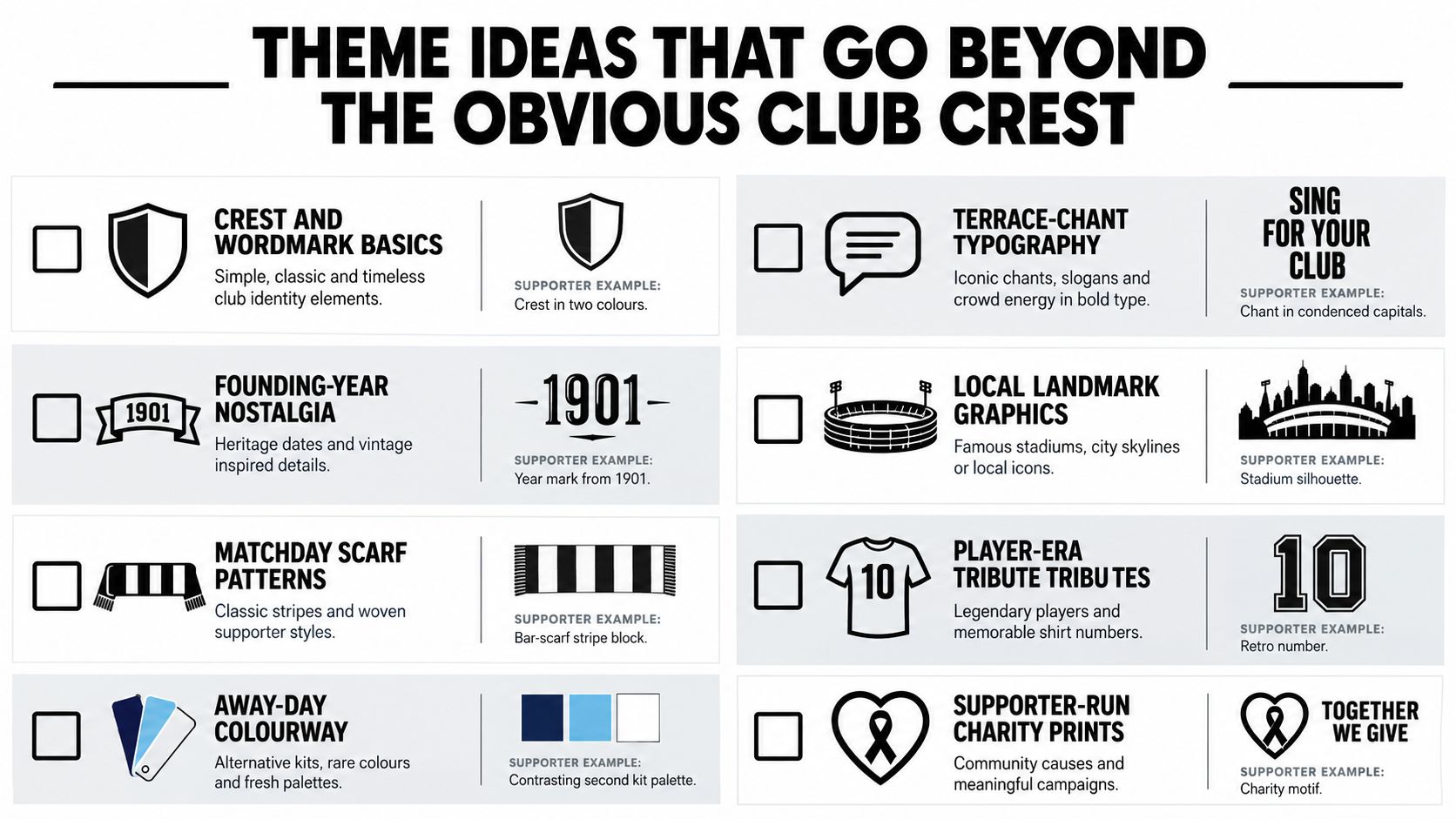
Eight directions worth specifying
-
Crest and wordmark basics
Use a simplified two-colour shield on a black, navy or grey hoodie, with the team name set beneath it. Screen printing suits a clean flat crest, while embroidery works better when the mark has strong outlines and limited detail. -
Terrace-chant typography
Turn a chant into condensed capitals across the upper back, then keep the front almost empty. A short phrase in cream on burgundy or white on black feels more deliberate than a paragraph of lyrics. Screen print or DTF can handle the lettering, provided the type is thick enough for fleece. -
Founding-year nostalgia
A faded-gold chest hit reading something such as “Anfield 1892” creates a heritage mood without copying a current badge. Use a slab serif or vintage banner shape, then choose embroidery for a tactile small mark or a distressed print for a softer, worn-in look. -
City and postcode graphics
A stadium silhouette, district name or postcode can make the hoodie feel local rather than generic. Keep the drawing simple. Fine architectural detail tends to disappear on a napped fabric, especially when the print is small. -
European away-colour tributes
Borrow the mood of an old away palette, not protected club artwork. A cream hoodie with a contrasting green sleeve panel, or a dark base with a muted continental accent, gives supporters a recognisable reference without turning the garment into a replica. -
Goalkeeper-kit colour swings
Acid green, mint or electric yellow can be effective as a small crest, cuff detail or back number. A full bright hoodie is harder to style, so use the colour as an accent unless the wearer specifically wants a statement piece. -
Ultras-style graphic prints
Bold line art, block lettering and a large back composition can work for supporter groups. Avoid tiny symbols and crowded borders. DTF is useful for a detailed multi-colour design, while screen printing gives a stronger hand feel for simplified artwork. -
Fan-art illustrations
Draw the stadium roofline, an old turnstile, a famous local pub frontage or a scarf-waving silhouette. An original illustration creates more ownership than lifting a photograph, and it gives you a design that can be adapted for sleeves, mugs or a small chest mark.
If you're creating a group identity before you design the garment, guidance on how to name your team can help you find a name that looks good in a wordmark as well as sounding good on the terrace.
The strongest themes usually combine one public reference with one private detail. A city graphic can carry the club association, while a name, squad number or matchday date makes the hoodie belong to one person. That's a better route than stacking a crest, slogan, player image and sponsor-style panel into one overworked front print.
Colour Palettes and Typography That Look Intentional
Colour is often the difference between a supporter hoodie that feels like considered streetwear and one that looks like a rushed event order. Start with the base garment, because fleece changes how an ink colour appears and dark fabric can swallow low-contrast lettering.
A club-faithful palette uses the familiar primary and secondary colours, but limits them to a controlled placement. A red hoodie with a small cream and dark-green heritage mark can feel richer than a red hoodie covered in every available shade. Tonal blocking is even quieter: charcoal artwork on black, cream on stone or navy on blue. The design reveals itself through texture and light rather than contrast alone.
A neutral base with one club accent is the safest everyday option. Think oatmeal with a muted red sleeve detail, or washed grey with a single mint crest. Monochrome with one accent works well for a more fashion-led piece, especially when the accent appears on the drawcord, cuff print or small back number rather than everywhere at once.
Typography needs the same discipline. Condensed sans-serif lettering gives a wordmark an athletic, terrace-ready feel. Slab serifs suit founding years and heritage references. A handwritten script can work for a fan name on the back, but it needs enough weight to remain legible on fleece. Thin outlines and low-contrast type are where supposedly premium concepts fall apart.
| Pairing | Example look | Verdict |
|---|---|---|
| Cream condensed sans on charcoal | Short club wordmark at the chest | Clean and dependable |
| Faded gold slab serif on black | Heritage year with a small location line | Premium when kept restrained |
| White block type on a strong club colour | Large back chant | Effective, but can feel loud |
| Tonal grey sans on black | Minimal chest initials | Fashion-led and easy to wear |
| Fine script on mid-grey fleece | Personal name across the chest | Risky, because detail can disappear |
| Several bright colours on a dark base | Crest, slogan and illustration together | Usually cluttered unless carefully simplified |
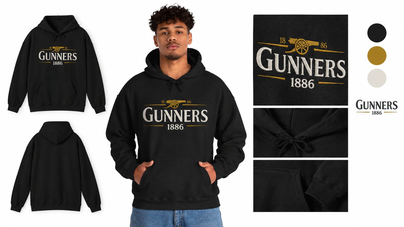
The Gunners 1886 Embroidered Hoodie is a useful example of the quieter route. Its embroidered “Gunners 1886” emblem, subtle gold accents, classic silhouette and slightly boxy cut suggest tradition without using official club branding. The midweight 50/50 cotton-poly blend, brushed fleece interior, double-lined hood and kangaroo pocket also show why the blank matters as much as the emblem.
Before approving artwork, test the design as a two-colour version on the actual grey or dark hoodie. If the mark only works with a complicated colour treatment, it probably hasn't been designed strongly enough yet. Ask the decorator for a physical proof where possible. Screen previews can't show how thread, ink and fleece texture interact.
Print and Embroidery Methods for Every Design Style
Choose decoration by the artwork's demands, not by the cheapest line on a supplier sheet. A bold crest, a photographic fan illustration and a one-off name-and-number set need different treatment.
Screen printing remains a strong choice for bold, flat artwork with a limited palette. It gives a familiar printed hand feel and works well for chants, wordmarks and simplified crests. The trade-off is setup, colour separation and less freedom for photographic gradients. Fine detail also suffers when the hoodie has a heavy raised nap.
DTG suits detailed full-colour artwork on cotton-rich garments. Cotton fibres absorb the ink and can produce a softer result, particularly when the design contains tonal transitions. DTF is more versatile across cotton and synthetic fabrics, making it useful for mixed-fibre blanks, dark garments and personalised names. The Printful UK guide to personalised hoodies explains the practical material distinction, including why cotton-based garments tend to deliver vibrant DTG results and why polyester-rich surfaces suit all-over dye-bond printing.
Sublimation and all-over printing need the right polyester surface. They're useful for full-coverage sleeves or performance-style designs, but they aren't the default answer for a cotton-rich supporter hoodie. Heat-transfer vinyl is convenient for individual names and numbers, although large areas can feel heavier and less integrated than a properly printed graphic.
Embroidery gives a raised, premium finish to a small crest, club initials or cuff detail. It's a poor choice for a large dense chest design. After repeated washing, large embroidered areas can flatten, pucker the surrounding fleece and become uncomfortable under a coat. A compact left-chest emblem or wrist mark generally holds up better.
The season test: If the design needs to remain comfortable under a jacket, keep embroidery small and keep heavy transfer areas away from the main flex points.
For cotton hoodies, DTF transfers are commonly pressed at about 160 to 165°C for 12 to 15 seconds, while polyester-rich blends often need around 150 to 155°C with shorter dwell times to reduce dye migration, as outlined in UK custom hoodie printing guidance. That difference matters with red and dark team colours, where excess heat can cause bleeding or fabric distortion.
| Method | Best for | MOQ | Hand feel | Durability | Cost per unit |
|---|---|---|---|---|---|
| Screen printing | Bold crests, chants and limited-colour graphics | Often suited to grouped orders | Ink layer, from soft to substantial | Strong when cured correctly | Usually improves as the run grows |
| DTG | Detailed artwork on cotton-rich fleece | Suitable for small runs | Soft, absorbed finish | Good with correct care | Quoted by garment and print area |
| DTF | Personalised graphics across mixed fibres | Suitable for one-offs and grouped orders | Noticeable transfer film | Strong when pressed and washed correctly | Varies with size and artwork |
| Sublimation or all-over print | Polyester-rich full-coverage designs | Supplier dependent | Dye is integrated into the surface | Strong on the right blank | Depends on coverage and blank |
| Heat-transfer vinyl | Individual names, numbers and simple marks | Suitable for individual pieces | Smooth, sometimes heavier | Good for controlled applications | Depends on cut area and setup |
| Embroidery | Small crests, initials and premium details | Supplier dependent | Raised and tactile | Strong for compact designs | Depends on stitch count |
For a clear explanation of the difference between embroidery and printing, compare the finish, artwork complexity and intended wear before asking for a quote. A decorator should also confirm how your chosen method behaves on heavyweight fleece, where fine lines can sink into the surface.
Fabric, Weight and Fit Choices That Change the Whole Feel
The blank decides whether your idea feels like a proper garment or a graphic placed on a sweatshirt as an afterthought. For everyday supporter wear, an 80/20 cotton-polyester blend is a practical balance of comfort, shape retention and printability. A 100% cotton blank can offer a more vintage, washed-in character, but it may shrink and change size if care and pre-treatment aren't controlled.
Polyester-rich garments suit technical, moisture-aware styling and all-over decoration. Tri-blends can create a softer fashion silhouette, although their texture and colour variation can make exact print matching harder. Heavyweight loopback terry gives a more jacket-like presence, while brushed-back fleece is the warmer choice for winter away days. Unbrushed fleece is better when the hoodie needs to layer comfortably in spring.
Fit changes placement more than many teams realise. On a regular cut, a centre-chest crest can sit at a familiar height. On a relaxed or boxy cut, the same artwork may need to move slightly higher or become smaller so it doesn't look lost across the wider front. A cropped oversized shape changes the balance again, particularly if the wearer layers it over a longer shirt.
Match the blank to the wearer
- Regular fit: The safest choice for mixed supporter groups and conventional crest placement.
- Relaxed fit: Better for casual styling, with enough room for a back print or layered shirt.
- Boxy fit: Strong for a streetwear-led design, especially with a small chest mark and broad sleeve detail.
- Cropped oversized fit: More directional and harder to size across a mixed group, so use it only when the wearer profile is clear.
A ring-spun yarn usually gives a smoother surface for detailed artwork than a rougher open-end yarn. That doesn't make every ring-spun blank automatically superior, but it can help small lettering and fine illustration read more cleanly. Ask for a sample rather than trusting the garment name alone.
| Blend | Weight | Best for | Fit pairings | Print method that suits it |
|---|---|---|---|---|
| Cotton-rich blend | Midweight to heavy | Everyday supporter wear | Regular or relaxed | DTG, DTF, screen print |
| 100% cotton | Light to heavy | Vintage and natural-hand-feel designs | Relaxed or boxy | DTG, screen print, embroidery |
| Polyester-rich | Midweight to technical | Performance styling and full coverage | Relaxed or oversized | DTF, sublimation, embroidery |
| Tri-blend | Light to midweight | Soft lifestyle pieces | Regular or relaxed | DTG or restrained screen print |
| Loopback terry | Midweight to heavy | Premium transitional layering | Boxy or relaxed | Screen print, DTF, small embroidery |
| Brushed-back fleece | Midweight to heavy | Cold-weather matchday wear | Regular, relaxed or boxy | DTF, DTG on suitable face, embroidery |
Use SoccerWares' hoodie sizing chart alongside the supplier's own garment measurements. Never assume that a large in one blank will fit like a large in another, particularly when a relaxed cut is being sold as a fashion silhouette.
Mockups, Ordering and Labelling Without the Headaches
Most bad fan-gear orders fail before printing. The organiser approves a flat digital mockup, skips the sample, then discovers that the crest is too low, the red is wrong or the “premium” embroidery has swallowed the pocket seam.
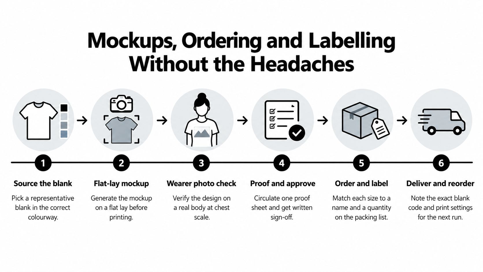
Build a proofing workflow
- Source the blank first. Confirm the exact colourway, fabric blend, fit and size measurements. A mockup made on a generic black hoodie won't reveal how your selected charcoal or washed red behaves.
- Create a flat-lay mockup. Check proportion, negative space and how the artwork relates to the pocket, seams and hood.
- Check the design on a wearer. A crest that looks balanced on a flat garment can sit too low on a body, particularly on a boxy or oversized fit.
- Confirm colour and decoration. Ask for a Pantone match where colour consistency matters, then request a printed sample or pre-production proof.
- Approve the size run in writing. List each size, quantity, personalisation and placement on one document. Don't rely on a chat message or a memory of who ordered what.
- Record the production details. Save the blank code, artwork version, decoration method, care instructions and approved proof so a reorder doesn't become a new experiment.
For adult supporter groups, use a balanced size curve based on actual wearer information rather than guessing. For children, collect height, chest and preferred fit, then allow room to grow without making sleeves unsafe or the body unwearably large. Drawcords need particular care on kids' garments, and small detachable decorative elements should be avoided.
UK labelling is not optional. For textiles sold in England, Scotland and Wales, the label must show fibre content. If the garment contains separate components with different fibre contents, each component needs its own fibre information, as set out in UK textile labelling guidance. Manufacturers and retailers share responsibility for getting that information right.
Product labelling may also need to cover care instructions, country of origin, safety information and environmental details. UKFT's labelling guidance notes that fibre-content labelling is mandatory under the 2012 Textile Products (Labelling and Fibre Composition) Regulations. Use a permanent garment label for the required information, then add a removable swing tag for the supporter group, event or collection story.
Before bulk approval: Wash the sample according to its care label, inspect the print and embroidery, and check that the label remains readable.
Don't ignore cotton shrinkage, skip the first-wash test or assume a care instruction copied from another blank is accurate. For prices and quantities in product copy, follow clear UK formatting, including the pound sign before the amount, as recommended in UK content writing guidance. When you're comparing a group order with existing supporter ranges, custom team hoodies can also help you think through personalisation and presentation.
The video is useful as a visual reminder that ordering is a production process, not just an artwork upload. Keep one approved physical sample with the order paperwork, especially if the hoodie will be reordered for another fixture or gifting occasion.
Gift, Kids and Squad Variants Worth Considering
Pick the wearer first, then the occasion, then the design, then the quantity. Reverse that order and it's easy to spend money on decoration the recipient won't wear.
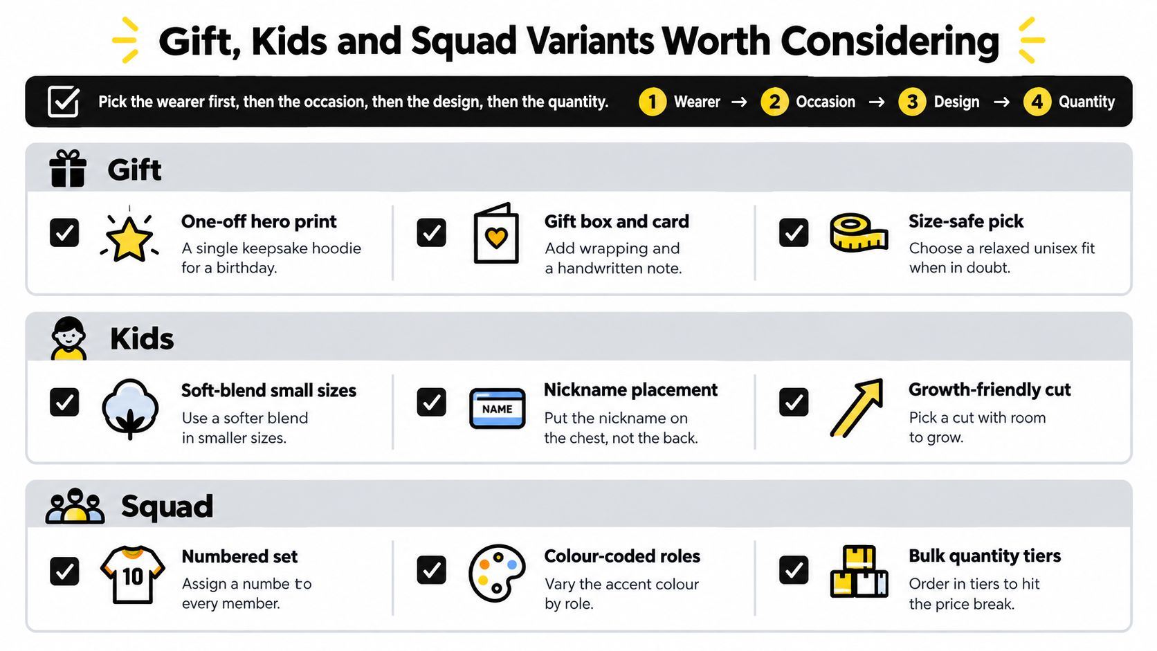
Gifts that feel personal without becoming novelty wear
For a partner of a football obsessive, use a neutral base with a small tonal crest, initials or city reference. They get the connection without being forced into a giant badge. A milestone birthday hoodie can carry a promotion year, final-season reference or debut-match detail on the back, paired with a restrained front mark.
Kit-room staff, coaches and volunteers need a different treatment. A left-chest emblem, surname detail or small sleeve identifier feels more useful than a full supporter graphic. If you're planning workplace gifting, this guide to impress employees with branded swag is useful for thinking about whether the garment feels like a genuine gift or a uniform extension.
Children's versions need different priorities
Choose a soft hand-feel print and avoid thick raised decoration where possible. Water-based or discharge-style finishes can feel more comfortable against skin than a heavy plastic layer. Don't add small detachable items such as decorative embroidered zips, and check that drawcords and trims are appropriate for the intended age group.
A roomier cut can allow for growth, but sizing up too far creates long sleeves, a low crest and a garment the child won't enjoy wearing. Put a nickname on the chest rather than the back if you want it to remain visible under a coat. For more present ideas, see kids' football gifts.
Squad orders need consistency
Use one approved placement standard for every name and number. Decide whether names sit above numbers, below them or on the sleeve, then keep the typeface, height and colour consistent across the run. Personalisation should add identity without making each hoodie look like it belongs to a different collection.
Before committing, work through this action list:
- Within the next 30 days: Choose the wearer group, garment fit, base colour and one theme. Produce a flat-lay and wearer mockup.
- Within the next 60 days: Order or inspect a representative sample, confirm decoration, wash-test it and approve the size list.
- Within the next 90 days: Finalise labels, packing details and reorder records, then place the run with one written proof.
The safest custom hoodie ideas are rarely the busiest. They give supporters a garment with a clear football reference, a comfortable fit and one personal detail that makes it theirs.
SoccerWares offers custom-designed football apparel alongside supporter merchandise, drinkware and training essentials, giving you options for a coordinated fan or squad order. Visit SoccerWares to explore hoodie-led supporter designs and choose a starting point for your next matchday, gift or team run.