

Ever watched a weather forecast showing where rain is heaviest? A soccer heat map works on a similar principle, but for a football pitch. It’s a visual summary of a player’s entire game, showing you precisely where they were most active and influential over 90 minutes. The 'hot' red zones are where they spent the most time, making things happen.
What Is a Soccer Heat Map?
Simply put, a soccer heat map is a data visualisation that converts a player's raw movement data into an easy-to-read, colour-coded graphic. Think of it as painting a picture of a player’s territorial influence. The brighter and redder an area is, the more time and action the player had in that specific zone.
Conversely, cooler colours like green and blue show where the player was less involved. This simple but powerful concept has completely changed how we analyse the beautiful game, allowing us to see beyond just goals and assists.
It gives you a crystal-clear view of a player's tactical contribution. This data is usually collected by advanced systems, including the clever soccer GPS trackers used by everyone from Premier League professionals to dedicated amateurs.
The Story Behind the Colours
The real magic of a heat map is its ability to tell a story at a glance. It instantly reveals a player's work rate, defensive commitment, or positional discipline, all without you having to wade through complicated spreadsheets. It makes complex football analytics accessible to everyone.
For example, a hard-working central midfielder’s map should be lit up like a spine right through the middle of the pitch. A classic winger’s map should be a bright streak hugging the touchline. These visual clues give you immediate insights.
This screenshot shows a classic heat map for a left-sided player, almost certainly a full-back or winger.
You can see the intense red and yellow areas are concentrated high up the pitch along the left flank. It’s a clear sign of a very attack-minded performance.
To help you get the hang of it, this table breaks down what each colour is telling you.
Decoding a Soccer Heat Map at a Glance
This table breaks down the key visual elements of a typical heat map to help you quickly understand the story behind the colours.
| Colour | Meaning | What It Tells You |
|---|---|---|
| Red (Hot) | High Concentration of Activity | This is the player's "home base" — where they spent the most time, made the most touches, and had the biggest impact. |
| Yellow | Frequent Activity | The player was here often, but it wasn't their primary zone. Think of it as their secondary operational area. |
| Green | Moderate Activity | The player passed through or made occasional actions here, but it's not a core part of their game. |
| Blue (Cool) | Low/Infrequent Activity | The player barely visited this area. It's on the periphery of their influence. |
| No Colour | No Activity | The player was never in this part of the pitch during the match. |
Once you get used to seeing these patterns, you can read a player's entire performance in seconds.
Why Heat Maps Matter in Modern Football
Understanding heat maps allows coaches, fans, and players to see the tactical blueprint of a match unfold. They have become vital for several key reasons:
- Performance Analysis: Coaches can instantly see if a player is following instructions, covering the right spaces, and contributing to both attack and defence.
- Player Development: A player can look at their own heat map to spot weaknesses. Are they neglecting defensive duties? Are they failing to get into goal-scoring positions? The map doesn't lie.
- Scouting and Recruitment: Clubs use heat maps to vet potential signings, ensuring a player’s natural movements and style will fit into their system.
A heat map doesn't just show where a player ran; it reveals their intent, their discipline, and their impact on the game's geography. It's a tactical fingerprint left on the pitch.
Ultimately, this tool is a cornerstone of modern performance analysis. If you're new to the world of player data, our beginner's guide to football analytics is a great place to build your foundation. Heat maps are a fantastic visual entry point into a much deeper statistical world, making the beautiful game even more fascinating to follow.
How to Analyse a Player's Heat Map Like a Pro
Learning to read a player's heat map is a skill that completely changes how you watch a match. It’s about turning those colourful blobs of data into real, tangible insights about a player's performance. You stop just watching the game and start seeing the stories unfolding on the pitch.
First things first, you have to consider the player’s position and what their job is supposed to be. A box-to-box midfielder, for example, should have a map that looks like a long spine down the centre of the pitch, showing they’ve been everywhere from one penalty area to the other. In contrast, a modern winger's map ought to be blazing with intense red patches right up against the touchline, deep inside the opposition's half.
This diagram breaks down the simple journey from a player’s movement to the visual analysis you see on screen.
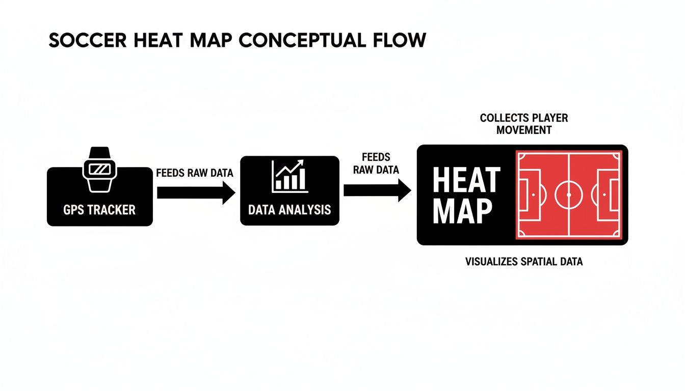
As you can see, it all starts with a wearable GPS tracker. That raw data is processed and analysed before being turned into the final heat map you see on your screen.
Asking Critical Questions
Once you have the positional context sorted, it's time to dig a little deeper by asking some critical questions. This is where you uncover the subtle details of a player’s performance that basic stats often miss. The answers can tell you a lot about their tactical discipline, decision-making, and overall impact.
A great place to start is with their positional discipline. Does the heat map show they’re actually sticking to the position their manager wants them in? If a central defender’s map has a big hot spot near the corner flag, it could be a red flag that they were constantly dragged out of position, leaving the backline exposed.
Another key question is whether the player is drifting into effective areas. A striker’s map might be glowing red, but if all that action is 30 yards from goal, are they really a threat? Or are they dropping too deep, failing to occupy defenders where it really hurts?
The most insightful analysis often comes from comparing a player's heat map directly against their opponent's. Overlaying the two can reveal who really dominated a specific zone on the pitch.
Key Analytical Points to Consider
To give your analysis some structure, it helps to focus on a few key areas. Breaking it down this way makes it much easier to spot trends and draw solid conclusions, whether you're looking at a Premier League match or your own game data.
- Territorial Dominance: Where are the "hot" zones? A player who consistently owns the space between the opponent's midfield and defence is often the one pulling the strings.
- Work Rate vs. Efficiency: Is a massive, spread-out heat map a sign of an incredible work rate, or just aimless running? You need to compare the map to their actual touches and successful actions in those key zones to know for sure.
- Defensive vs. Offensive Balance: Look at how the heat is split between their own half and the opposition's. It’s the quickest way to see a player's main contribution—are they a defensive rock or a driving attacking force?
This approach unlocks a much deeper layer of the game. The data itself comes from some pretty sophisticated tracking, and you can learn more about the numbers behind the visuals in our detailed guide on how to read football GPS data. By applying these principles, every heat map becomes a rich tactical story just waiting to be told.
Uncovering the Tactical Stories Heat Maps Tell
It’s one thing to track a single player’s hustle, but when you combine the data for an entire team, the soccer heat map starts to tell a much bigger story. It becomes a visual fingerprint of the team's tactical DNA.
You are no longer just seeing individual effort; you are seeing the manager's philosophy played out right there on the pitch. These aggregated visuals show you the collective identity of the squad.

This bird's-eye view lets analysts and fans see the game through the manager's eyes. The patterns that emerge from eleven players moving together paint a clear picture of the team’s game plan.
Visualising a Team's Philosophy
Take a team that loves to press high up the pitch. Their heat map will be glowing with intense red and yellow zones deep inside the opposition's half. Those hot spots are the result of their forwards and midfielders hunting in packs, trying to win the ball back as close to the other team's goal as possible.
Now, picture a team that famously 'parks the bus'. Their heat map tells a completely different tale. It will be heavily concentrated in and around their own penalty box, with deep red areas showing a low block designed to frustrate attackers and protect their goal at all costs.
These visuals make complex tactics instantly understandable. You don't need to be a seasoned pundit to look at a heat map and figure out if a team is built to dominate possession or to soak up pressure and hit on the counter-attack.
Identifying Tactical Trends and Weaknesses
By looking at a team’s soccer heat map over several games, you can start to notice their habits and default settings. This is where it becomes a powerful weapon for opposition scouting and pre-match preparation.
A team's collective heat map is like its signature. It shows not just where they play, but how they play, revealing their strengths and, more importantly, their exploitable habits.
Does the map consistently show an overload down one flank? That’s a massive clue that they’re trying to create 2-v-1 situations to get crosses in. Does it reveal cooler, blueish areas between the defence and midfield? That could be a structural weakness—a pocket of space a clever number 10 would love to operate in.
A quick scan can tell you a lot:
- Spotting Overloads: Bright, concentrated patches on one side of the pitch scream "key attacking strategy!"
- Identifying Gaps: Cool or empty zones between players can point to a lack of cohesion or a defensive vulnerability.
- Revealing Player Roles: The map can show if wing-backs are told to bomb forward or if a defensive midfielder is tasked with shielding the back four.
This kind of analysis turns abstract tactical talk into something you can actually see and prove. Of course, heat maps aren't the only way to break down performance; understanding concepts like what DVOA offers for deeper football analysis can add another layer of insight.
Ultimately, team heat maps pull back the curtain on the beautiful game, making high-level strategy visible enough for any fan to see and appreciate.
Exploring Advanced Pass and Scoreline Heat Maps
A standard soccer heat map is brilliant for tracking a player's movement and general work rate, but the technology can go so much deeper. By changing the focus from just where a player runs to what they do, we can unlock advanced visualisations that tell a much richer tactical story.
One of the most powerful examples is the pass heat map. Instead of showing where a player was on the pitch, this visualises where a team's passes actually come from. The result is a crystal-clear picture of the team's creative engine room, instantly showing you who is pulling the strings and building attacks.
For instance, a team that patiently builds from the back will have bright hot spots over their central defenders. In contrast, a team that funnels everything through one star midfielder will show a huge red patch right in the centre of the park. This shifts the analysis from simple effort to genuine influence.
Decoding Statistical Patterns with Scoreline Maps
Another fascinating spin on this is the scoreline heat map. This type of visualisation steps back from a single match and instead crunches the data from an entire season or league to reveal powerful statistical trends. It can show you which scorelines are most common for a particular club or across the league as a whole.
This kind of data offers a unique insight into a team's personality and habits. A scoreline map might reveal that a certain team almost always concedes just before half-time, pointing to a serious concentration issue. Or it could show that an opponent is at their most dangerous in the final 15 minutes of a match, giving coaches a clear warning to stay switched on.
These advanced maps are the bridge between simply tracking movement and truly understanding strategic patterns on the pitch. They turn abstract numbers into clear, actionable intelligence.
A pass heat map doesn't just show you where the ball was; it shows you who was asking the questions. It reveals the creative hub of the team, making the invisible strings of playmaking visible to everyone.
Pass heat maps have certainly changed how UK football fans break down Premier League tactics. This was perfectly illustrated with England's Women's team during the Euro 2022 qualifiers. Analysts used visualisations to pinpoint the most dangerous passes made in the crucial 15-second windows right before a shot was taken. You can discover more about how these visualisations expose tactical details on The Set Pieces.
Gathering this level of detailed information is also becoming more accessible. Advanced camera systems are crucial for this kind of professional analysis, and you can explore our guide on the best AI sports cameras for 2025 to see how this technology is changing the game. These tools provide the rich data needed to generate these insightful visualisations, giving teams at every level a genuine competitive edge.
Using Heat Maps to Elevate Your Own Game
Not so long ago, this kind of powerful data was strictly for the pros. Now, thanks to modern wearable tech, that same insight is within reach for players at every level. You can generate your own soccer heat map and give yourself a genuine competitive edge.
This technology takes your post-match review from just a gut feeling to a proper, data-driven analysis. When you study your own heat map, you’ll find clear, actionable ways to improve that you’d probably miss otherwise.

Think about a young winger who comes off the pitch feeling like they had a busy game. Their heat map might tell a different story, revealing that most of their work was done too deep. That's hard proof they need to be more aggressive and get into attacking positions. Visual evidence like that is much more powerful than just a hunch.
Turning Data Into On-Field Action
The real magic of a personal heat map is using it to set tangible, measurable goals. It gives you a clear baseline from which to build a targeted training plan.
For instance, a central midfielder might spot cool, blue gaps in their coverage across the middle of the park. This immediately flags a need to work on their stamina or positional awareness, ensuring they're covering the ground they need to cover for the full 90 minutes.
With that insight, they can set specific objectives for their next match.
- Increase Touches in the Final Third: Make a conscious effort to get more involved in attacking plays by pushing into more advanced areas.
- Improve Defensive Positioning: Focus on staying central to avoid being dragged out wide, something their heat map flagged as a weak spot.
- Boost Work Rate: Set a goal to cover more distance, making sure their next heat map shows a more complete, box-to-box presence.
Your personal heat map is an honest mirror. It doesn't care about opinions; it shows you exactly where you were and, more importantly, where you weren't. Use it to hold yourself accountable and drive real progress.
Connecting Analysis with Practical Training
Once you've pinpointed areas for improvement, you can link them directly to what you do on the training ground. A forward whose heat map shows they’re barely touching the ball inside the box can dedicate time to drills focused on penalty-area movement and finishing.
This is where training aids come in handy. Using things like rebounders and pop-up goals helps you simulate match scenarios, letting you practise shooting and receiving the ball in the exact zones your heat map says you need to work on.
Of course, turning these insights into better on-pitch performance also means looking after your body. A comprehensive guide to recovery equipment for athletes can help you heal faster and reduce soreness, ensuring you’re physically ready to hit your new performance targets.
Getting started with this data-driven approach is easier than ever. For any player looking to dive in, there are countless options out there. You can discover more by checking out our guide on the top football apps for players, which will help you track, analyse, and visualise your performance to take your game to the next level.
Common Questions About Soccer Heat Maps
As you start digging into performance data, a few questions always seem to surface. Getting your head around the finer points of a soccer heat map means you can use this brilliant tool with more confidence, ensuring you’re pulling the right insights from the data—whether you're breaking down a professional match or your own game.
To wrap things up, here are some straight answers to the most common queries.
Are Heat Maps Always an Accurate Reflection of a Player's Performance?
A heat map is a fantastic way to see a player's positioning, movement, and general work rate, but it certainly doesn't tell the whole story on its own. It shows where a player was, but not the quality of what they did there.
Think about it: a defender's map might be glowing bright red inside their own penalty box. On the surface, it looks like they were in the thick of the action. But this could simply mean their team was under constant pressure, forcing them into non-stop, last-ditch defending. It shows they were present, but it doesn't separate a perfectly timed tackle from a missed one.
Heat maps are most powerful when you pair them with other key stats, like pass completion rates, successful tackles, or shots on target. That combination is what creates a much richer, more accurate picture of a player’s true performance.
What Technology Is Used to Create a Soccer Heat Map?
At the top professional level, heat maps are generated using highly advanced optical tracking systems. This involves a number of high-speed cameras dotted around the stadium that track the exact coordinates of every single player on the pitch for the entire match.
But for grassroots, academy, and amateur players, wearable tech offers a brilliant and much more accessible alternative.
- Soccer GPS Trackers: These are small devices worn in a special vest between the shoulder blades. They use GPS and accelerometers to track movement, total distance, sprint speeds, and intensity.
- Mobile Apps: All that raw data is then automatically synced with a dedicated smartphone app.
- Visualisation: The app crunches the numbers and produces your personal soccer heat map, usually alongside other key performance metrics.
It’s this kind of technology that brings professional-level analysis to anyone who is serious about improving their game.
How Can I Use a Heat Map to Compare Two Different Players?
Placing heat maps side-by-side is a superb way to analyse player roles and tactical battles. For instance, if you place two central midfielders' maps next to each other, you can instantly see who played a more defensive game (with more heat in their own half) versus who was bombing forward (with intense patches in the final third).
Overlaying their maps can be even more revealing. This trick can show you which player covered more ground or who truly owned a specific, critical zone on the pitch. It gives you a clear, visual verdict on their individual duel, turning a complex tactical story into something that’s dead simple to understand.
Ready to stop guessing and start measuring your performance? At SoccerWares, we offer the latest in soccer GPS trackers and training equipment to help you analyse your game like the pros. Explore our collection and find the tools you need to elevate your performance.